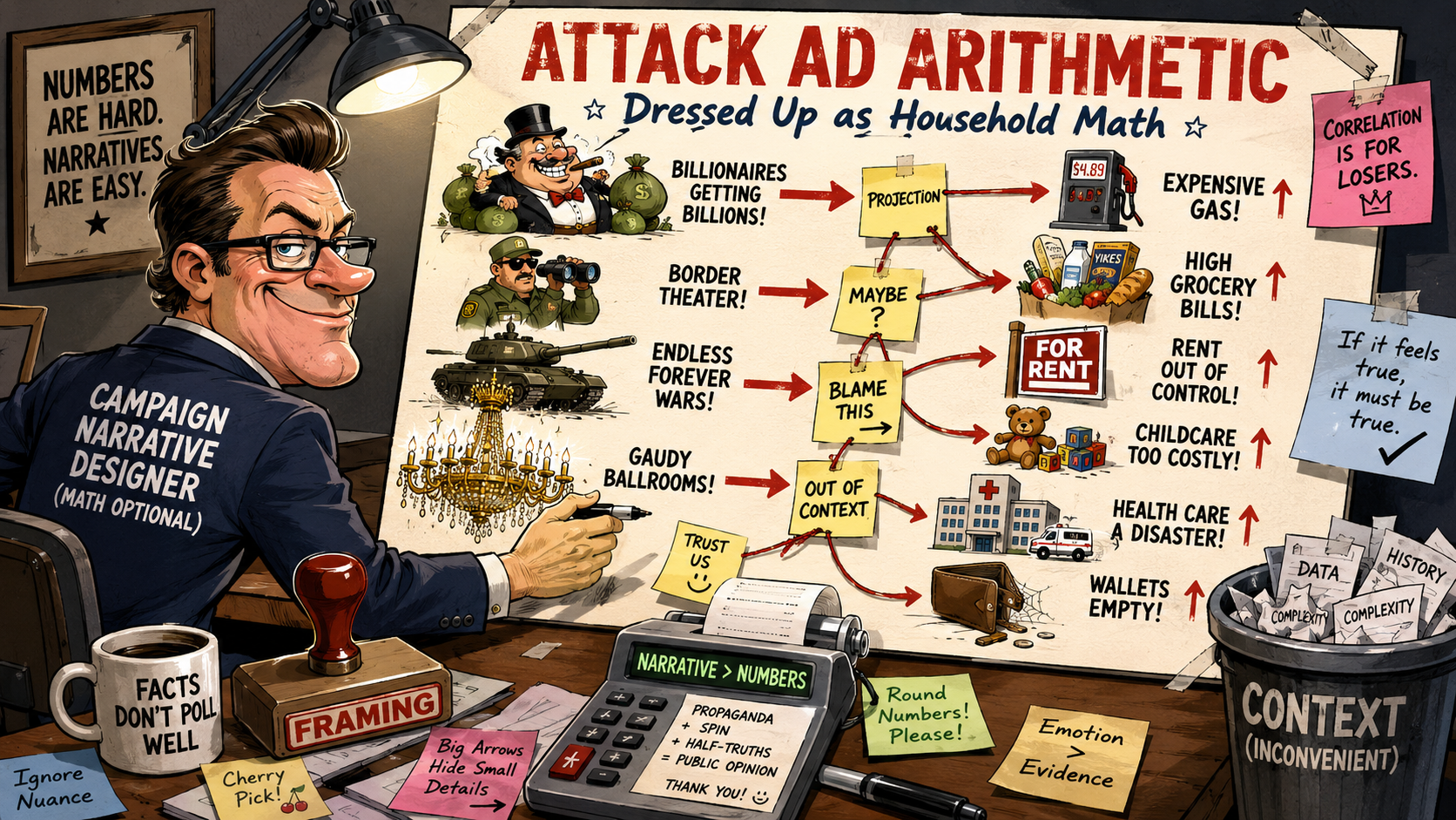
A political graphic has been circulating in Pennsylvania from an organization called "Families Over Billionaires." It is colorful, simple, emotional and easy to share. It lists expensive things at the top — tax cuts, immigration enforcement, a White House ballroom — and painful household costs at the bottom, then invites the viewer to draw one conclusion: Republicans gave money to billionaires, ICE, war and a White House renovation, and now Pennsylvanians are paying more for gas, groceries, insurance, rent, energy and child care while losing health care, food assistance, hospitals and jobs. That is the message. The problem is that the graphic does not prove that case. It borrows enough real numbers to look credible, then uses those numbers to make claims the numbers do not actually support. A number without context can be technically true and deeply misleading at the same time. This graphic exploits that gap at every turn.
The $4.5 Trillion Tax Cut Claim
The graphic says Trump and Republicans prioritized "$4.5 trillion in tax cuts for billionaires." There is a real number underneath that claim. The Congressional Budget Office estimated that the legislation would reduce federal revenues by roughly $4.5 trillion over the 2025–2034 period. That is a legitimate budget figure. But calling the entire $4.5 trillion "tax cuts for billionaires" is political framing, not a precise factual statement. The CBO number is a total revenue-loss estimate across the entire law — not a line item that says "billionaires only." High-income taxpayers likely benefit disproportionately, and that is a legitimate debate worth having. But the graphic's wording makes it sound as if $4.5 trillion was handed exclusively to billionaires, which is not what the CBO figure means. A more honest version would say: "CBO estimated the law would reduce federal revenues by about $4.5 trillion over ten years, with critics arguing the benefits disproportionately favor wealthy taxpayers." That would be fair. "$4.5 trillion in tax cuts for billionaires" is a slogan.
The $70 Billion ICE and CBP Claim
The graphic says Republicans prioritized "$70 billion more for ICE and CBP violence." Again, there is a real number underneath. Senate Republicans supported a bill including roughly $70 billion for immigration enforcement through the Department of Homeland Security. But the phrase "ICE and CBP violence" is not a neutral description. It is activist language. A person can oppose aggressive immigration enforcement. A person can argue these agencies have abused authority. A person can argue the money leads to more raids, more detentions and more confrontations. Those are legitimate positions to hold and defend. But the graphic does not make that argument. It simply calls the funding "for violence" and moves on. That is persuasion dressed as fact. A more honest claim would say: "Republicans supported roughly $70 billion in additional immigration enforcement funding, which critics argue would expand ICE and CBP operations." That lets the reader understand both the policy and the criticism. The graphic skips to the verdict.
The White House Ballroom Claim Is the Weakest of All
The graphic says Republicans prioritized "$1 billion-plus for a gaudy White House Ballroom." This is the shakiest claim in the image. There was reporting about a proposed $1 billion funding provision connected to security upgrades related to a White House renovation project. But that is not the same as saying Republicans spent $1 billion on a ballroom. The ballroom project itself was reported at closer to $400 million. The $1 billion provision was reportedly dropped after procedural and political opposition. The graphic compresses a ballroom project, security-related funding, a proposed provision and a provision that was reportedly removed into one emotional claim. If the money was not approved in the way the graphic suggests, the claim is misleading. If the $1 billion was not simply "for a ballroom," the claim is misleading again. There is a valid political argument that spending hundreds of millions on White House renovations while Americans struggle is poor optics. The graphic overreaches by choosing the most inflammatory version of that argument rather than the most accurate one.
The graphic mixes three categories of claims and makes them look like one. First, some real numbers — the CBO revenue estimate and AAA gas price figures appear to have factual grounding. Second, projections from advocacy groups and policy models about what could happen under certain cuts. Third, opinion language — words like "violence," "gaudy" and "tax cuts for billionaires" are not neutral descriptions; they are designed to produce a reaction. Individually, some of these claims can be discussed seriously. Together, they create a false sense of certainty. The viewer is not being asked to think. The viewer is being pushed to feel.
Gas Prices: The Number May Be Right, the Blame Is Not Proven
The graphic lists Pennsylvania's average daily gas price at $4.64 per gallon, a number that appears consistent with AAA data for the cited period. The number is not the problem. The implied blame is. Gas prices are affected by oil markets, refining capacity, supply disruptions, seasonal blends, state taxes, demand, geopolitical instability and global energy conditions. Politicians on both sides love to blame the other party for gas prices, but the reality is always more complicated. If gas prices are high in Pennsylvania, that is a real burden. But the graphic does not prove that Trump and Republicans directly caused that price. It places the number under the heading "What's the cost?" and lets the reader assume the connection. That is not evidence. That is layout.
Groceries, Rent, Child Care, Insurance and Energy Are Real Problems With Unproven Causes
No serious person should deny that these are genuine burdens on Pennsylvania families. Rent is too high. Child care is outrageous. Food prices have risen. Insurance costs are punishing households. Energy bills matter, especially to working families and seniors on fixed incomes. The costs are real. The issue is causation, and the graphic does not do the work of proving it. It does not separate national inflation from state-level conditions. It does not separate market forces from federal policy. It does not identify time periods clearly. It does not show whether a number is current, projected, average, selective or based on a particular household type. The graphic simply presents these costs as direct consequences of the priorities listed at the top of the image and expects the reader to complete the logic. That is not analysis. That is arrangement.
The Health Care, SNAP, Hospital and Job-Loss Claims Are Mostly Projections
The right side of the graphic is the most problematic because it lists service losses as if they are already confirmed. It says 557,868 Pennsylvanians are "losing health care." It says nine or more rural hospitals are "closing." It says 143,000 people are "losing food assistance." It says 52,000 jobs are "lost." These claims appear to be based largely on projections from Democratic, progressive and policy-advocacy sources about the possible consequences of Medicaid, SNAP and clean-energy cuts. Projections can be useful. They can warn people about likely consequences. They can help voters understand what budget cuts might produce. But projections are not the same thing as confirmed present-tense losses.
The graphic does not say "could lose." It does not say "projected to lose." It does not say "at risk." It says "losing," "closing" and "jobs lost." That is a major difference — one that transforms a warning about possible consequences into a statement of current fact. The two things are not the same and the graphic knows it.
If a study says a policy could cause job losses, that is not the same as saying those jobs are already gone. If an advocacy group estimates hundreds of thousands could lose health coverage, that is not the same as saying they already have. If hospitals are at financial risk, that is not the same as saying they are definitively closing. The graphic chooses the stronger emotional wording every single time, and that is not an accident.
What a Serious Criticism Would Look Like
There is a legitimate argument to be made against the Republican budget priorities this graphic is attacking. Large tax cuts increase deficits. High-income households benefit disproportionately from certain provisions. Heavy immigration enforcement funding comes with real human costs. Medicaid and SNAP cuts could genuinely harm vulnerable people. Symbolic spending on White House renovations looks terrible when ordinary families are struggling. These are real arguments that deserve serious treatment. A serious argument would distinguish between approved spending and proposed spending, between total tax cuts and tax cuts specifically benefiting top earners, between current losses and projected losses, between risk of closure and actual closure and between market-driven price increases and policy-caused price increases. The graphic does none of that. It wants the emotional force of certainty without the burden of careful explanation.
My Bottom Line
The Families Over Billionaires graphic is not pure fiction — that is what makes it effective. It uses enough real numbers to look factual. The $4.5 trillion figure is a legitimate CBO revenue estimate, but it is not literally a $4.5 trillion payment to billionaires. The $70 billion immigration figure refers to enforcement funding, while "violence" is activist language added for effect. The White House ballroom claim is particularly weak because the $1 billion figure was tied to security funding and was reportedly dropped, while the ballroom project was reported at a lower figure. The health care, SNAP, hospital and job-loss claims are mostly projections presented as current confirmed reality. And while gas, groceries, rent, insurance, child care and energy costs are genuine problems in Pennsylvania, the graphic does not prove Republicans caused each one — it simply places them in proximity and lets the reader make the connection.
This is not a neutral cost-of-living analysis. It is a political attack ad that has dressed itself in the visual language of data. The difference matters, because people who share it believe they are sharing facts. They are sharing arguments. Those are different things, and a public that cannot tell them apart is a public that cannot evaluate the policies being debated on its behalf.
Real numbers in the wrong context with the wrong framing produce false conclusions just as reliably as fake numbers. The viewer is not being asked to think. The viewer is being pushed to feel. That is the tell.
Why This Matters
Political graphics like this one succeed because they exploit a gap between how information looks and what it actually proves. A number in a colored box with a bold font feels like evidence. It is not evidence until it is connected to a cause, a time period, a methodology and an honest accounting of alternative explanations. The public is being flooded with this kind of material from both sides of the political spectrum. Learning to read it critically — asking what category of claim is being made, whether projections are being presented as current facts, whether opinion language is substituting for neutral description, and whether the graphic is proving a case or just arranging images to produce a feeling — is not a partisan skill. It is a civic one. The alternative is a public that votes based on emotional reactions to well-designed propaganda and calls it being informed.
References
- Congressional Budget Office. (2025). Cost estimate: Public Law 119-21. cbo.gov.
- AAA. (2025–2026). Daily gas price averages by state. gasprices.aaa.com.
- U.S. Senate. (2025). Big Beautiful Bill: Department of Homeland Security appropriations — immigration enforcement funding. senate.gov.
- Families Over Billionaires. (2026). Pennsylvania advocacy graphic: What Trump and Republicans prioritized. [circulated on social media].
- Politico / Washington Post reporting on White House renovation funding provisions and reporting on the $1 billion security provision. (2025–2026).
Disclaimer: The views expressed in this post are the personal opinions of the author and are offered for educational, commentary and public discourse purposes only. They do not represent the positions of any institution, employer, organization or affiliated entity. Nothing in this post constitutes legal, financial, medical or professional advice of any kind. References to budget figures, legislation and advocacy materials are based on publicly available sources cited above. Commentary on political subjects reflects the author's independent analysis and is protected expression of opinion. Readers are encouraged to consult primary sources and form their own conclusions.